Voting Issues in the 2012 Election

By Kim Smiley

Prior to the election on November 6, 2012, some reporters were predicting that the results of the presidential election, which was expected to be nail biter, may not be known for weeks . While this was obviously not the case, there were a few real  hiccups in the voting process.

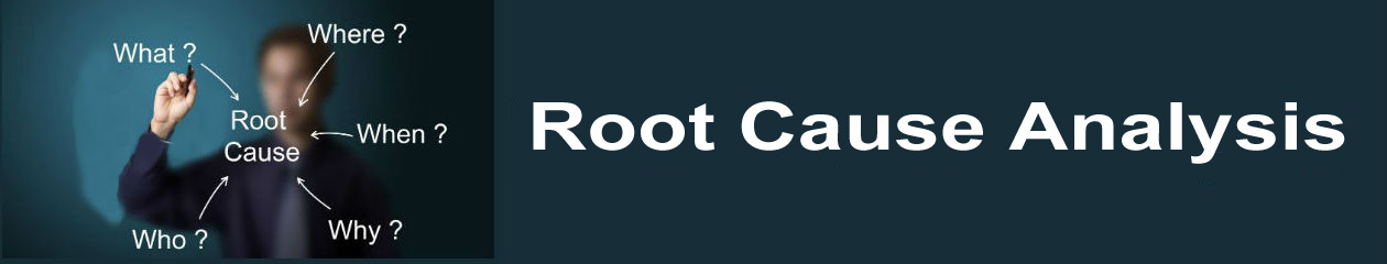
The voting issues of the 2012 election can be analyzed by building a Cause Map, an intuitive, visual format for performing a root cause analysis.  The first step of the Cause Mapping process is to create an Outline that lays out the basic information of an issue and also lists the impact to the overall organizational goals.  In this example, the general public is considered the “customer” and the voting issues were an impact to the customer service goal since anything that makes it difficult for eligible voters to cast a ballot means the government is not providing adequate customer service to the public.

The next step is to ask “why” questions to understand the different causes that contributed to the problem.  Why were there issues voting?  Part of what made this specific election difficult was the aftermath of Hurricane Sandy.  Areas in the northeast were still without power.  Temporary polling locations had to be established and the change in the normal process was confusing to voters.  Just providing information to voters was complicated because many homes were still without power or damaged and some residents were displaced.

There was also confusion over changes to voter laws prior to the election.  The most publicized example of this is the voter identification laws passed in Pennsylvania.  A law was passed in Pennsylvania that required all voters to show an official form of photo identification, but the law was challenged in court.  Advocates of the law say that it will prevent voter fraud.  Opponents of the law say that it will prevent eligible voters from being able to cast ballots because not all voters have photo identification, a particular issue for the elderly, poor and minorities.  A judge ruled that the law would not apply to the election because voters didn’t have enough time to acquire their photo identification.  This new law and subsequent ruling confused some poll workers and there have been cases reported where voters were turned away for not having identification when it was not yet required.

There were also very long lines reported at some polling locations.  Some voters in Virginia and Texas waited four hours to vote.  This was caused in part because this was a presidential election and predicted to be very close so there was higher than normal voter turnout.  Long lines tend to happen near the end of the day after the traditional workday ends.  Some polling locations also had problems that slowed the process like broken voting machines or staff that didn’t show up.

Luckily, the voting issues didn’t delay the election results and any voters that were mistakenly turned away because of new laws or unable to vote because of the impacts of Sandy would not have changed the overall result of the election.  But officials could certainly use the lessons learned from the 2012 election to help ensure a smoother process for the next presidential election.

Deadly Superstorm Slams the US

By Kim Smiley

Hurricane Sandy pummeled the Mid-Atlantic region of the United States on October 29th  and 30th, 2012, leaving more than eight million people without electricity, causing massive flooding and killing over 110 people.  The damage done by this storm was massive and economic impacts have been predicted to be as high as 50 billion dollars.

Why was Sandy so devastating?  This question can be answered by building a Cause Map, an intuitive format for performing a root cause analysis.  A Cause Map is a useful tool for breaking down this complicated issue and can help explain why this storm was unique.

In this example, there are a number of things that combined to made Sandy a unique and especially dangerous storm.  First off, Sandy wasn’t just a normal hurricane.  As hurricane Sandy moved to the north it converged with other weather systems turning into a hybrid storm.  This hybrid storm brought with it a combination of extreme summer weather (strong winds with heavy rains) and winter weather (cold temperatures and snow).  Unusual timing of the different weather systems helped this superstorm form.  Hurricane Sandy hit very late in hurricane system and cold air sweeping down from Canada was colder than typical for this time of year, a combination that proved deadly.  The nature of these converging weather patterns also made Sandy a very slow moving storm so that areas experienced higher rain fall and more damage than they might have with a faster moving system.

Normal hurricanes are powered by the warm, moist tropical air and weaken as they travel north.  They also typically turn to the right and head out to sea.  When Sandy converged with the other systems it became an extra-tropical cyclone and actually strengthened as it hit shore.  The effects of these other weather systems also turned the storm left onto land and it took an unusual path over some of the most heavily populated areas of the US, including NYC,  intensifying the impact of the storm.

The timing of Sandy also impacted the peak flood levels.  Sandy hit during a full moon when tides are at the highest point of the month.  During a full moon, the effects of the moon’s gravity are felt the strongest so tides are higher.  The high winds created by Sandy combined with the full moon resulted in a massive storm surge.

Sandy truly was a Superstorm.  Weather systems that normally don’t exist at the same time converged to create a massive storm that moved in a usual path over one of the most heavily populated regions in the US.  And the storm hit at the worst time of the month for flooding.

For more information click here or here.  To view a high level Cause Map of this issue, click “Download PDF” above.


The Comet That Couldn’t Fly

By ThinkReliability Staff

“… the most exhaustively tested airplane in history.”

-Expert opinion on the DeHavilland Comet

Today, commercial jet air travel is standard fare. Estimates for the amount of air traffic over the United States in a given day have been in the range of 87,000 flights. With clever planning, clear skies and smooth service, a citizen almost anywhere in the world can get anywhere else by plane in less than 24 hours. But looking back at the history of aviation show us how far safety has come. Consider the DeHavilland Comet, the first commercial jet to reach production. British aviation specialists finalized the Comet’s design with much excitement in 1945 in hopes it would position their industry to establish a revolutionary service in commercial jet flight. Unfortunately, the Comet crashed on January 10th and April 8th in 1954.

What happened? We can identify some of the causes in a Cause Map, or visual root cause analysis.

CAUSE #1: POOR TESTING When you test an extremely heavy object carrying hundreds of people at high speeds thousands of feet above the ground, you would think planning for the worst case scenario would make the most sense. Unfortunately, the Comet tests were performed in tainted conditions on the strongest part of the plane.

Add in the fact that there was no prototype for the plane and you’ve got a test not worth having… and a plane not worth flying.

CAUSE #2: UNEXPECTED PRESSURE Altitude leads to pressure, and pressure puts stress on planes. But this stress wasn’t evenly distributed, and certain parts of the planes’ bodies were unevenly affected. So rather than the expected amount of pressure on the planes, the Comets faced an unforeseen squeeze.  

CAUSE #3: FLYING ABOVE AND BEYOND The Comet flew at twice the speed, height and cabin pressure of any previous aircraft, displaying a rather dangerous amount of ambition.

Combine all of this, Cause Map it, and you’ve got a plane flying under incredible conditions it couldn’t withstand, facing high pressure where it was most vulnerable.

In other words, an airborne recipe for disaster.

FALLOUT #1) SAFETY As expected, the pressure cycle in the planes’ cabins cracked the bodies of the planes. When the planes broke up, the lives of 56 passengers and crew members were lost.

#2) CUSTOMER SERVICE Some British industry institutions have a highly prestigious reputation (the Royal Navy’s impact on British sea travel comes to mind). The loss of the aircraft, though, was a black eye on British Aviation. Aviation historian George Bibel called the Comet an “adventurous step forward and a supreme tragedy.”

#3) MATERIALS/LABOR Effective airplanes have never been cheap, and this was no different. Not only would it cost money to investigate the cause of the accidents, but to replace the airplanes.   

FUTURE SOLUTION The Comet’s tragic crash had one silver lining: the post-crash analysis performed by its designers (including Sir Geoffrey de Havilland) set the precedent for future air accident investigations. In fact, the Comet was redesigned to solve the issues that caused the crashes and would later fly successfully. But by then, Boeing had already taken over most of the commercial jet market.

In the end, the Comet was first in flight but last in the market.

See more aviation cause maps:

Want us to cause map a specific plane crash for you? Tell us in the comments and we’ll pilot our way through it.

Rogue Ocean Fertilization Experiment Done

By Kim Smiley

An entrepreneur created a massive bloom of plankton after he dumped a hundred tons of iron dust into the Pacific Ocean off western Canada last June.  This action has sparked outrage because an individual manipulated the environment without government approval or scientific oversight.

A Cause Map, a visual format for performing a root cause analysis, can be built to analyze this issue.  The first step in building a Cause Map is to determine how the issue impacts the overall goals.  The next step is to ask “why” questions and the answers are then organized into cause-and-effect relationships so that all factors that contributed to a problem are laid out in an intuitive format.  In this example, impacts to several goals are worth considering.

The first issue is that nobody knows exactly how the environment will respond to this much iron being put into the ocean.  The environmental impacts may well turn out to be minimal, but this is by far the largest experiment of this type done to date so nobody really knows how big the impact will be.  The experiment is also particularly worrisome because there wasn’t adequate scientific oversight or approvals for it.  The man conducting the experiment was an entrepreneur hoping to make money.  A local tribe hired the entrepreneur to fertilize the ocean with iron in a bid to increase the local salmon population by increasing their food supply.  Adding iron to the ocean can create a rapid increase in the phytoplankton population, which are the base of the aquatic food chain, because iron is often the limiting nutrient for phytoplankton growth.  Iron is necessary for photosynthesis and thus phytoplankton growth.  But iron is also highly insoluble in sea water so large areas of the ocean have limited iron supplies.

The entrepreneur also hoped to find a way to cash in on carbon offset credits because phytoplankton blooms may be a way to sequester carbon and improve greenhouse gas numbers in the environment.  This may work because phytoplankton absorb carbon dioxide during their life and when they die they sink into the ocean, taking the carbon dioxide with them and removing it from the atmosphere.

The second issue is that there are known risks associated with large blooms of phytoplankton.  They can negatively affect the other aquatic life in the region because large blooms can deplete the ocean of oxygen.  This occurs because the populations of other microorganisms will increase since the increase in phytoplankton provides a larger food supply.  Some of these other microorganisms absorb oxygen so more of them means less oxygen for other aquatic life. Phytoplankton live near the surface, but they sink as they die so a bloom will impact the food supply and oxygen levels throughout the entire depth of the ocean.

A final goal worth considering is the impact this has on public opinion.  Iron fertilization is a contentious issue to begin with because many people are opposed to purposefully manipulating the environment.  When somebody dumps tons of iron into the ocean without solid scientific involvement it understandablely outrages the public. The negative press will make it harder for any legitimate scientific research being done in this field.

This issue has been covered by The New York Times , The New Yorker  and NBC news. Click on any of these links to learn more about this issue.  Click on “Download PDF” above to view a high level Cause Map.


Toyota Recalls Millions of Vehicles Because of Fire Risk

By Kim Smiley

On October 11, 2012, Toyota announced a recall of 7.4 million vehicles worldwide due to a potential fire hazard.  This newest recall comes on the heels of the heavily publicized unintended acceleration issue and puts Toyota once again in an unwanted spotlight.

A Cause Map, a visual format for performing a root cause analysis, can be built to help analyze this issue.  The first step in building a Cause Map is to create an Outline that lays out how the issue impacts the overall goals of an organization.  In this example, the safety goal is impacted because of the potential for injuries and car accidents.  The production goal is impacted because of the effort needed to recall millions of vehicles.  The customer service goal is also impacted because of the negative publicity that a recall of this size will generate.  After the impact to the goals is determined, “why” questions are asked to determine what causes contributed to the issue and to create the Cause Map.

Starting with the production goal, we would ask “why” millions of vehicles were being recalled.  This is happening because there is a component that may need to be repaired, the component is in many vehicles and there is a potential for injuries if the component isn’t repaired.  A component needs to be repaired because the power-window switches pose a fire risk.  Some of the power-window switches feel sticky when operated and if some commonly available lubricants are applied it will create a fire hazard because the switch can melt.  There are millions of these power-window switches to repair because they were used across multiple models for several years because using standard parts is usually cheaper.  There is a potential for injuries because a fire starting in the power-window switch while the car is driving would be pretty distracting.

This recall will generate negative publicity because it is a huge recall, the a largest vehicle recall since Ford Motor Co recalled 7.9 million vehicles in 1996, and the timing is a bit unfortunate since it comes shortly after the unintended acceleration issues that resulted in large recalls.  In fact, some of the vehicles being recalled this round are the same vehicles that have had previous recalls, a fact that probably isn’t reassuring to owners.

The good news is that the fix for this problem is relatively simple beyond the innate hassle of taking a vehicle to the dealer.  The recall consists of a technician inspecting, disassembling and applying approved fluorine grease to the power-window switch, improving the sticky operation and decreasing the likelihood that some handy soul might apply an unapproved lubricant and inadvertently melt the part.

To view a high level Cause Map of this issue, click on “Download PDF” above.

Supply of Disposable Diapers Threatened by Explosion at Chemical Plant

By Kim Smiley

On September 29, 2012, an explosion at a chemical plant in Japan killed a fire fighter, injured 35 others and did significantly damage.  Chemicals produced at the plant are used in disposable diapers.  The damaged plant will be inoperable for the foreseeable future, which will likely impact the global supply of disposable diapers, a thought that strikes fear in the hearts of many parents of small children.

This incident can be analyzed by building a Cause Map, an intuitive, visual format for performing a root cause analysis.  The first step in building a Cause Map is to identify which goals were affected.  In this case, the safety goal is obviously impacted since there was a fatality and injuries.  The production goal is also a major consideration since the supply of disposable diapers is threatened because the plant will be unable to produce chemicals for a significant amount of time.  The next step is to ask “why” questions to add additional boxes to the Cause Map.

Starting with the safety goal first, we would ask “why” there was a fatality and injuries.  In this example, people were hurt because there was a fire at a chemical plant.  The fire occurred because a tank exploded and it was near other tanks full of flammable chemicals.  The tank exploded because the temperature inside the tank was increasing and it wasn’t cooled in time.  It isn’t clear yet why the temperature was increasing inside the tank, but investigators are working to find the cause.  Once it is known, it can be added to the Cause Map.

At the time of the explosion, efforts were underway to cool off the tank, but they weren’t effective.  Firefighters were working to spray down the tank with cool water to help lower the temperature, but the temperature rose too quickly.  This is also a cause of the fatality.  A fireman was working to connect spray lines near the tank at the time it exploded and he was sprayed with hot chemicals.  Other injuries occurred at the time of explosion and others were sustained during the effort to fight the fire.  It’s possible that one of the reasons that the workers were unable to cool the tank was that the usual method of cooling the tank, injecting nitrogen to decrease the oxygen and control the chemical reactions occurring, might not have been functioning properly.  This is another area that can be clarified on the Cause Map as more information is known.

Looking at the production goal now, a potential shortage of disposable diapers may occur as a result of this accident because the plant produced a significant amount of a chemical used in manufacturing diapers.  This plant produced 20% of world’s supply of one chemical in particular needed for diapers.  Combine this with the fact that the other plants manufacturing this chemical are already operating at maximum capacity and the supply will likely be less than the demand.

The final step in the process is to use the Cause Map to develop solutions to help prevent similar problems from occurring in the future.  It’s premature to discuss specific solutions in this example since the investigation is still ongoing, but the initial Cause Map can easily be expanded and used when all the information is available.

The Dangerous Combination of Hot Cars and Children

By Kim Smiley

Every summer, the news covers heartbreaking stories of children who die after being inadvertently left inside a vehicle.  Since 1998, 527 children have died from heat stroke from being exposed to high temperatures inside a vehicle.  One of the most tragic elements of these stories is that these deaths are preventable.

This issue can be analyzed by building a Cause Map, a visual root cause analysis that intuitively lays out all the causes that contributed to the problem. The first step in building a Cause Map is to determine how the issue affects the overall goals.  In this example, the safety goal is the obvious focus since there have been hundreds of deaths.  The next step is to ask “why” questions and add the answers to the Cause Map.  Why have 527 children died?  They died of heat stroke because they were left inside a car and the interior of the car was hot.  Children also overheat quicker than adults because their thermoregulatory system isn’t as efficient.

The children were left inside the car because they were inadvertently forgotten, a caregiver intentionally left them inside or the children managed to get inside the cars themselves.  There are a number of reasons that a caregiver could forget a small child. The most frightening thing about these incidents is that it can happen to well intentioned, loving parents who simply make a terrible mistake.  These incidents tend to occur most often when there is a change of routine, such as a different parent than normal doing the daycare drop off.  It certainly doesn’t help that many parents and caregivers of young children are tired and potentially sleep deprived. The driver may also not be able to see a small child because many states require backward facing car seats in the back seat.   In the cases where a caregiver intentionally leaves a child and no harm was intended, it’s safe to assume that they didn’t understand the danger.  There are also cases where a child enters a car and becomes trapped inside.  In those examples, the vehicle was most likely unlocked and the caregiver didn’t realize the child was playing in the vehicle.

Vehicles are  especially dangerous because they heat up very quickly to dangerous levels.  A car is an enclosed space with a lot of windows to let in sunlight, making it an ideal situation for temperatures to increase.  Even relatively mild days can result in hot temperatures inside a car.  The temperature inside a car can raise about 40 degrees even when the ambient temperatures are in the 70s, meaning the inside of a car can be over 110 degrees on a fairly cool day.

There are a number of gadgets people have invented to help prevent children from being inadvertently forgotten in a car, but their effectiveness is debated.  The simplest way to prevent this from happening is very low tech; put your purse, shoe or anything that you must have in the backseat.  Another suggestion is to keep a large stuffed animal in the car seat and then move it up to the front passenger seat while the car seat is occupied so that you have a visual reminder of your precious cargo.  The most important thing is to be aware of this deadly problem and have a plan to prevent it if you ever drive around children, especially those strapped into car seats.

Why Giant Pandas are Endangered

By Kim Smiley

Panda breeding programs continue to struggle, a fact unfortunately highlighted by the recent death of a week old panda cub at the National Zoo on September 23, 2012.  Breeding programs are an important part of the panda conservation effort since the adored animals are endangered with only an estimated 1,600 remaining in the wild and about 300 in captivity.

The factors that contributed to pandas becoming endangered can be analyzed by building a Cause Map, a visual root cause analysis.  A Cause Map is an intuitive way to show the cause-and-effect relationships between the different causes that contribute to an issue. In this example, a good starting point is to ask why pandas are endangered.  This happened because there aren’t enough viable habitats, pandas have a low birth rate and panda cubs have a high mortality rate.

The panda habitat has significantly decreased because the bamboo forests are being cleared as the region becomes more industrialized.  Pandas also need a large habitat.   They are large animals who consume mostly bamboo so a lot of it is needed to sustain them.  The average panda can consume 20 to 30 pounds of bamboo shoots each day. They are also solitary, territorial creatures and do not like to live close to each other.

Pandas also have a notoriously low birth rate, in the wild and especially in captivity.  Female pandas are only fertile once a year for a very short window, about 36 hours.  In the wild, pandas have to find a mate (that they don’t typically live near) while fertile to produce a cub for the year.  Pandas in captivity struggle with conception even when they share an enclosure with a potential mate because they seem to lose interest in “natural breeding”.  The recent cub born at the National Zoo was the product of artificial insemination.  If a panda does manage to conceive, she will still only raise a single cub per year.  Most of the time only a single baby is born, but even if twins occur only one usually survives.

Panda cubs that are born also face a high mortality rate.  Twenty-five percent of panda cubs born in the US don’t survive their first year and the numbers are lower in the Chinese breeding centers.  This occurs because panda cubs are born very small, about the size of a stick of butter, and immature.  The newborns are helpless, pink and blind and require a lot of care taking to survive.  There is also the heart breaking chance that a mother panda can inadvertently injure her cub because she is much larger than her newborn and needs to handle it frequently to nurse it and care for it.

At this point, no captive panda has successfully been reintroduced into the wild and it’s unlikely that they will be in the foreseeable future.  Only time will tell if conservation efforts are successful for the giant pandas.

To view a high level Cause Map of this issue, click “Download PDF” above.

Rising Grain Prices 2003-2012

By ThinkReliability Staff

Grain prices have more than doubled since the year 2003, even down from their record high prices in 2008.  Grain is used for food, animal feed, and ethanol.  The demand for grain for all of these uses is increasing, but the supply is not keeping up.  This, along with other factors, has increased the price of grain to the point where it can be disastrous to the world’s poorest citizens.

We can examine the effect of the increased price of grain in a Cause Map.  A Cause Map allows us to lay out cause-and-effect relationships in an easy to understand, visual format.  To begin the Cause Map, we determine the impacts to the goals.  In this case, because we are looking at the grain price increases for the years 2003-2012 worldwide, our goals are broad.  The safety goal is impacted because there has been a high impact on the nutrition of the poor.  Grain prices have led to food riots in many locations, which is another impact to the safety goal.  The environmental goal has been impacted by the loss of usable cropland.  The increase in food prices can be considered an impact to the customer service goal.  Demand outpacing supply can be considered a production goal (considering the worldwide demand and supply).  Lastly, the increase in the price of grain itself can be considered an impact to the property goal.

Beginning with the safety goals: nutritional deficiency and food riots resulting from the increase in the price of food.  The increase in the price of food affects the poor in two ways – it reduces individual buying ability and reduces the amount of food aid that can be bought for the same amount of money.  In short, a country providing a consistent monetary amount of food aid will provide less aid when the food is more expensive.  This double whammy is further worsened considering the impact of the cost of fuel – as it increases, even less food can be bought per aid dollar.

The increase in the price of food is directly impacted by the price of grain.  Grain is used as a food itself, as well as feed for animals that are used for food, and is a component of many other produced foods.  The cost of all these foods go up as the price of grain increases.

Why is the price of grain increasing?  There are many factors that result in the increase in the price of grain.  Firstly the cost of grain goes up as the cost of the fuel needed to transport it and the cost of fertilizer needed to grow it increase.  As the demand for fertilizer grows, the cost grows.  The demand grows, as the demand for all crops grows.

The supply vs. demand equation also contributes to the cost of grain.  When demand increases, and supply does not keep up, cost goes up.  The demand for grain has been increasing – for food to feed the growing population, and to produce input-intensive foods, which actually require more grain.  (For example, about 7 kg of grain are required to get 1 kg of beef.  As the demand for input-intensive foods increases, the demand for grain increases even more.)  The government mandates and subsidies that require the use of grain for bio-fuels – driven by the   increasing cost of oil – also substantially increases the demand for grains.  Making matters worse, in order to attempt to protect their population and agricultural industry, countries have been restricting exports and/or hoarding, further decreasing available supply for trade.

Demand is not keeping up with supply.  The growth in agricultural productivity – which allows for a higher crop yield – has not increased as quickly as demand.  Crops are lost to agricultural pests, droughts and floods, and a particularly virulent strain of steam rust fungus, which has affected many grain crops.  Lastly usable cropland is being lost, due to urbanization to support that growing population, as well as erosion and water depletion, which can be impacted by poor land management.  In many cases, the investment and infrastructure to allow for agricultural advances just isn’t there.

The issues discussed above become a vicious cycle, making solutions that much more difficult and important.  Specifically, world organizations have asked countries to examine their agricultural policies, including ethanol mandates and subsidies, export restrictions and taxes, and hoarding.  Work on advanced bio-fuels or Brazilian sugar cane ethanol can reduce the amount of agricultural land devoted to producing crops for biofuels, rather than food.  Investment and development funds, as well as increased aid, are being sought to help remedy the current situation.  Import taxes into many countries that have food shortages have been reduced or removed to try to reduce the cost of food.  These are big solutions – for a big issue.  It is estimated that 16% of the world’s population is chronically under-nourished.  Further increases in the cost of food will only make the situation worse, without making some of the changes discussed here.

To view the Outline and Cause Map, please click “Download PDF” above.  Or click here to read more about the crisis and actions taken by the World Bank.

How a Toothbrush Helped Save the Space Station

By Kim Smiley

Using ingenuity reminiscent of Apollo 13, the crew on the International Space Station (ISS) recently found a way to fix an ailing electrical system using handmade tools made with an allen wrench, a wire brush, a bolt and a toothbrush.

The events that led to this dramatic repair attempt can be built into a Cause Map, a visual root cause analysis to help illustrate the causes that contributed to the problem. In this example, the problem was an issue with the electrical system on the space station.  Electrical issues can obviously quickly become dangerous on a space station because the life support systems need electricity to function. The impacts to the schedule and potential issues with accomplishing all the mission goals are also worth considering.

In order to fix the problem, astronauts needed to replace a failed Main Bus Switching Unit, a component that is responsible for collecting and distributing power from the solar arrays.  The ISS has four Main Bus Switching Units and each serves two of the eight solar arrays so the loss of a one of the units significantly impacts power supply.

The units are located outside of the space station and the plan was to replace the malfunctioning unit during a spacewalk, but the two astronauts doing the work ran into a problem.  An accumulation of metal shavings caused a bolt to stick, preventing installation of the new unit.  The astronauts needed to find a way to remove the metal shavings, but none of the tools they had taken on the spacewalk could get the job done.

The nearest hardware store was over 200 miles of atmosphere away and the options were limited, but the crew found an elegantly simple solution to the problem.  They created a cleaning tool out of items onboard the space station, including a $3 toothbrush.  An extra space walk was planned, the metal shavings were cleared and the new Main Bus Switching Unit was successful installed.  A cheap toothbrush taped to a metal handle had helped fix a $100 billion space station.

And if you’re wondering which Astronaut drew the short end of the oral hygiene stick, don’t worry the tooth brush was a spare.

To view a high level Cause Map of this issue, click on “Download PDF” above.